Your cart is currently empty!

Scary Websites
—
by
“Currently computer graphics are used a great deal, but it can be excessive.”
~ Hayao Miyazaki
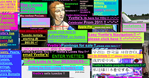
The other day, I was web-surfing while I waited for a program to download, and I came across a site that really caught my attention. In the upper right-hand corner, a big Jolly Roger pirate flag was waving. In the upper left-hand corner was a little animated dancing hamster. A tiny cartoon kitten ran across the bottom of the screen, and in the middle of the page fireworks burst out in an infinite loop. Then suddenly, my iPad started blasting “Whole Lotta Love” by Led Zeppelin. It was a full-blown spectacle!
I tried to scroll down the screen to find a “music off” button. But the screen went on and on… and on… and on. One very long screen with a black background and neon-colored type. No links, just text. And every few lines, new and even cheesier animation.
At this point, I was desperate to stop the music. So I backed out of the site so fast I still don’t know what it was advertising. A funeral home, I think. Or maybe socks. All I know is, I had to get out of there.
Thank goodness most people are better at designing websites these days. Bad web design used to be a lot more common, but it’s still out there. Running across this thing made me think about some design principles that you might want to think about the next time you look at your own website.
First, just because you can do something doesn’t necessarily mean that you should. Now, I know you’re proud that you can do Adobe Flash animations. I understand that. But that doesn’t mean your visitors should be bombarded with frolicking critters.
The purpose of your website is to attract and inform people, not to scare them away. So find another home for the dancing moose.
Second, just because you don’t know how to do something doesn’t mean you shouldn’t do it. What do I mean by that? Let’s go back to that terrible website. Remember, it had text, and more text, and more text, all on one never-ending page. I’m guessing that wasn’t by design. I bet that person just didn’t know how to create and link multiple pages.
Your website should look professional. If you don’t know how to create multiple pages with links, hire someone who does. Buy a ready-made website template. If you really don’t want to hire a pro, at least invest in yourself: take a course in the software so you can do it right. Don’t settle for amateurish results just because you don’t want to dish out the money to hire a professional. Penny wise and pound foolish, as they say.
Finally, be selective. Sometimes less is more. Too much text will turn off your reader. Too many graphics will make your site slow to load. Don’t count on people to wait it out. Instead, ask yourself this: What is it you want to say, and what’s the simplest way you can say it? You want artwork of some kind, but a couple of well-chosen images will be a lot more effective than wall-to-wall pictures.
These principles apply to any kind of marketing, of course. Simple, elegant, and professional will beat cute, cluttered, and cheesy every time. That goes for flyers, phone messages, and billboards as well as websites.
One last thing: Please don’t make your website play music automatically on your professional website. Just don’t. But if you really can’t resist the impulse to play Beethoven’s Fifth Symphony, at least make sure your visitors can find the “Music Off” button.
Because hey, that website is still giving me nightmares.
